Charting Methods
aliasPixel(width)
Let's say you have a 5 pixel wide and 2 pixel tall canvas. This is pretty much what those 10 pixels looks like to your browser.
![]()
The numbered black lines (the 3 horizontal ones and the 6 vertical ones separating the pixels) are what you use to tell the browser to draw lines.
Let's say you want to draw a line from the red dot to the blue dot - you tell the browser to draw a line from (1, 0) to (1, 5). That's not actually possible, because all the browser can do is control the pixels between the numbered lines.
So it does the next best thing - it turns the pixels on either side of your requested line on and we get a thick gray block (marked 1). That's a bit too thick, so we try (0, 0) to (0, 5) and we get the next thin gray block (marked 2). How about (2, 0) to (2, 5)? That gives us the last block (marked 3) - still gray.
![]()
Hm... how about we try fractions? (0.5, 0) to (0.5, 5) gives us a thick black line and so does (1.5, 0) to (1.5, 5) - that's more like it!
![]()
The browser is trying to draw a line exactly along the coordinates you specify - when these coordinates are exactly halfway between pixels, it turns those pixels on half way. This gives you a gray color (with a black stroke). If these coordinates are somewhere between pixels, the farther set of pixels is lighter and the closer set is darker. For instance, trying y = 1.05, 1.10, 1.15... gives you something like this - the bottom set of pixels get darker as the requested coordinates move closer to it.
![]()
The aliasPixel method helps you get crisper (thinner and darker) horizontal and vertical lines but only when you have integer coordinates. So, when you need a a 1 pixel wide horizontal line, you offset your y coordinates by 0.5 pixels so that the browser doesn't do any of anti-aliasing we saw earlier. You have to do the same thing for any width that is an odd number. If your line is 2 pixels wide you have to have 2 lines of pixels turned on. So the browser is not going to any anti-aliasing and you don't need any offset. The same goes for any width that is an even number.
Chart.helpers.aliasPixel(1)
// 0.5
Chart.helpers.aliasPixel(2)
// 0
Chart.helpers.aliasPixel(3)
// 0.5
Chart.helpers.aliasPixel(4)
// 0
All aliasPixel does is return this offset - 0.5 for odd numbers and 0 for even numbers.
By the way, there's one other thing that would make the pixels darker without changing the coordinates - you can just draw the same line multiple times. For instance, here's how (1, 0) to (1, 5) would look drawn once, twice and thrice.
![]()
distanceBetweenPoints(point1, point2)
The distance between point1 and point2. The method name may be a bit confusing because it does exactly what it says.
easingEffects
easingEffects is a collection of methods for animating chart elements. Animation logic is easy - we simply move whatever we want to animate, like height, width, or position towards their final value. Changing how we do this moving gives us different kinds of animation.
The simplest way to do this is to increase (or decrease) an initial value towards a final value uniformly over the given duration - this gives us a linear animation. Overshooting the final value, pulling back and repeating this a few times gives an elastic animation. Reaching the final value, then pulling back and repeating that a few times gives a bounce effect.
In general, if you give a cat a fish, it will leave your fishing rod alone. Also in general, if you give an animation method how much of the duration is complete and it will give us gives us a measure of how close we should be to the final value. So, if we give the linear animation method 50% - indicating that we are halfway through the duration, it will return 50% - indicating that we should be halfway to the final value.
Chart.helpers.easingEffects.linear(0.25);
// 0.25
Chart.helpers.easingEffects.linear(0.5);
// 0.5
Chart.helpers.easingEffects.linear(1);
// 1
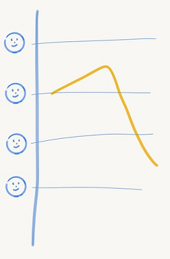
It's easier to visualize what's happening in an animation method if you plot it on a chart. With time along the horizontal and the return value along the vertical the easingEffects.linear looks like this.
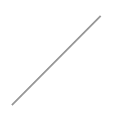
Which is pretty boring.
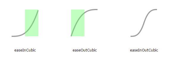
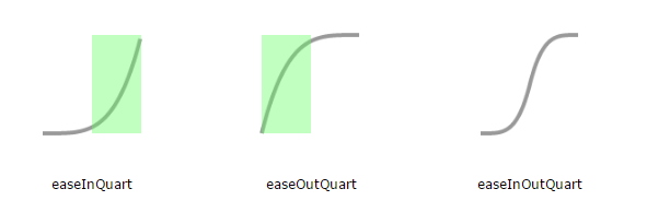
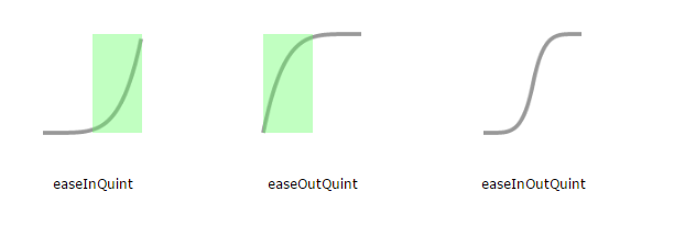
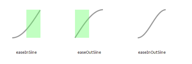
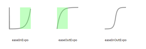
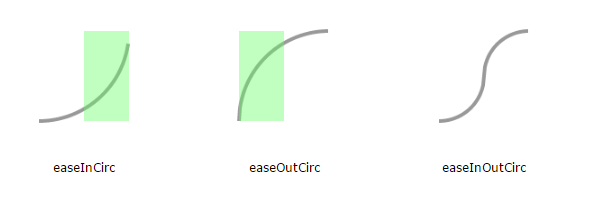
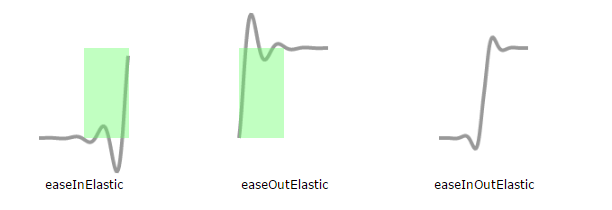
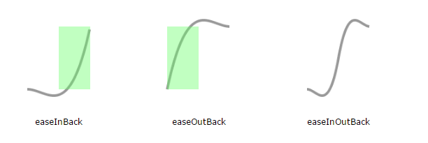
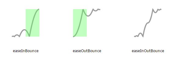
But there's a whole slew of animation methods in easingEffects. Each of these animation types has 3 variants depending on when we move towards the final value the most (as opposed to a lot of movement without going anywhere). For easeIn variants, its during the 2nd half of the duration, and for easeOut variants, its during the 1st half - as marked out by the green areas. easeInOut variants are a combination of the easeIn and _easeOut _variants.

Making our own easing function is easy - you just have to write a method that returns the initial value at the start and the final value at the end. And if you want to avoid jumps, just make sure that your function is continuous - that is, no breaks when you plot the chart.
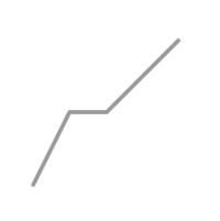
For instance, here is an animation method that moves linearly towards the final value for the 1st quarter of the duration, then pauses for the next quarter and finally moves linearly towards the final value for the remainder of the duration.
var customAnimation = function(t) {
    // move linearly - 1st quarter
    if (t < 0.25)
        // ensure a continuous line by moving at twice the rate to compensate for the pause
        return 2 * t;
    // pause - 2nd quarter
    else if (t < 0.5)
        return 0.5;
    // move linearly - last half duration
    else if (t > 0.5)
        return t;
};
getAngleFromPoint(centrePoint, anglePoint)
Returns an object containing the angle (in radians) between the line joining centrePoint (the red point) and anglePoint (the blue point) and the horizontal, and length of that line.
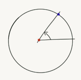
The angle in the 1st, 2nd and 3rd quadrants (the green ones) are positive and angle in the 4th quadrant (the red one) is negative.
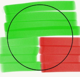
Chart.helpers.getAngleFromPoint(
    { x:  0, y: 0 },
    { x: 10, y: 0 }
);
// { angle: 0, distance: 10 }

Chart.helpers.getAngleFromPoint(
    { x:   0, y: 0 },
    { x: -10, y: 0 }
);
// { angle: 3.14..., distance: 10 } = { angle: PI, distance: 10 }

Chart.helpers.getAngleFromPoint(
    { x: 0, y:  0 },
    { x: 0, y: 10 }
);
// { angle: 1.57..., distance: 10 } = { angle: PI / 2, distance: 10 }

Chart.helpers.getAngleFromPoint(
    { x: 0, y:   0 },
    { x: 0, y: -10 }
);
// { angle: -1.57..., distance: 10 } = { angle: -PI / 2, distance: 10 }
niceNum(rangeOrSpan, round)
Drawing axes and gridlines at positions that the user can easily visualize makes a chart easier to read. For instance, it's easier to relate to a chart with gridlines at 10, 20, 30... versus one with gridlines are at 11, 22, 33....
To figure out a nice interval between gridlines, we call niceNum on a not-so-nice rangeOrSpan with round set to true. This snaps rangeOrSpan to the closest power of 10 multiple starting with a 1, a 2 or a 5 (making it nice)
Chart.helpers.niceNum(1.4, true);
// 1
Chart.helpers.niceNum(3.1, true);
// 5
Chart.helpers.niceNum(7.1, true);
// 10
To get a nice range from a not-so-nice ranges, we cannot round like we do for intervals. We need the nice range to cover the not-so-nice range - so no spare elbow or knee sticking out at either end.
We have to round up. We do this by setting round to false or not setting it at all.
Chart.helpers.niceNum(0.9);
// 1
Chart.helpers.niceNum(1.5);
// 2
Chart.helpers.niceNum(3);
// 5

Chart.helpers.niceNum(5.1);
// 10

Chart.helpers.niceNum(50);
// 50
splineCurve(startPoint, midPoint, endPoint, tension)
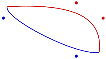
Quick detour because we are in the area - the canvas has a method called bezierCurveTo that draws a smooth line from the current position to a specified position given 2 control points. The control points adjust the curvature by basically pulling the line towards them.
For instance here's how the curve joining 2 points changes depending on the position of the control points - the red line curves more because the red points are farther from the end points.
The canvas bezier curve needs 2 control points and draws a cubic bezier curve. With a little bit of logic and a truck load of extrapolation, we can figure out the equation.
Lets start joining 2 points with any control points. Without anything to control the only smooth curve possible is a straight line between them.
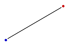
Let's say we want to figure out the x and y coordinates required to draw the line as a function of t - where t is how far the point we want to draw is from the blue line. We know that the equation should be linear because the line is straight (unless you have a curved screen) and since we know that it needs to depend on the red point and the blue point let's write it as.
Now, we know that when t is 0%, we should be at the and when t is 100%, we should be at . The easiest way to do that would be to set to and to .
Now, let's try that with 1 control point . We can presume that the equation must be quadratic and extrapolating from our previous equation we get something like this.
We can figure out the values for , and since we know that must be at and at . Also, if we move to be exactly midway on the line between and , must be at . Plugging in those values and solving for , and gives us the equation.
Similarly, with 2 control points and , the related cubic bezier is described by the following equation.
In case you are wondering why we express and as a function of instead of connecting them directly, that's because it's easier when it comes to drawing the curve. With the equations, we just have to connect the generated and to the last generated and . With and and equation, if you generate multiple values on an , it's a bit difficult to figure out which of these should be connected to the point we last generated and which of these comes later in the curve.
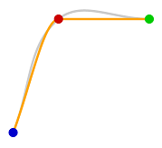
Back to the main plot now - bezier curves are a good way to draw smooth curves between 2 points and you can use 2 control points to adjust the curvature. Let's see what happens if we use 2 bezierCurveTo calls to join 3 points picking 2 control points for each curve randomly.
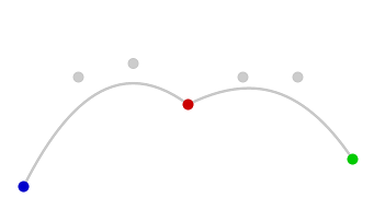
Well we got smooth curves, except at the red point where we switched from one bezier curve to another. But fear not! splineCurve gives us one control point each (previous and next) for each of the 2 curves so that they join smoothly1. tension controls how stretched out these control points cause the curve to be (use 0 if you want a straight line).
Chart.helpers.splineCurve(
    { x:   0, y: 300 },
    { x: 300, y:  50 },
    { x: 600, y: 200 },
    0.4
);
//  {
//      previous: { x: ..., y: ... },
//      next:     { x: ..., y: ... }
//  }
A tension of 0.4 gives us the 2 orange control points on either side of the red point and we get 2 curves that join much more smoothly.
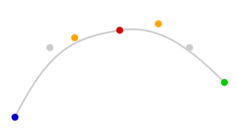
To generate the other control point for the curve joining the blue point to the red point, we can call splineCurve with (bluePoint, bluePoint, redPoint, ...). Similarly, to generate the other control point for the curve joining the red point to the green, the parameters (redPoint, greenPoint, greenPoint, ...) will give us a much nicer curve.
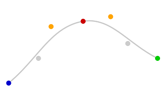
We could produce the same effect in a slightly different way. Both the startPoint and endPoint have an additional property skip. When this is true, that point is ignored and midPoint is taken instead. So splineCurve(startPoint, midPoint, endPoint, ...) with startPoint.skip = true is the same as splineCurve(midPoint, midPoint, endPoint, ...). This gives us the following curve.
splineCurveMonotone(points)
splineCurve has a slight problem that's pretty obvious with 3 points where the first curve has a large slope.
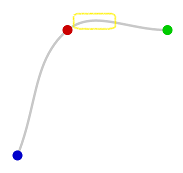
Notice that even though the red and green points are at the same level, the points in the yellow box are above both of them. In other words the curve is not montonic (because the y coordinates along the curve from red to green don't alway move towards green).
splineCurveMonotone corrects this problem. It also takes it parameters as an array of points with a property _model that is similar to the parameters we pass into splineCurve. And unlike splineCurve which returns an object, it updates the _model property with controlPointNextX, controlPointNextY, controlPointPreviousX and controlPointPreviousY.
var points = [{
        _model: { x:   0, y: 300 }
    }, {
        _model: { x: 100, y:  50 }
    }, {
        _model: { x: 300, y:  50 }
    }
];

Chart.helpers.splineCurveMonotone(points);
// _model properties have new properties added
Plotting bezier curves using the updated _model properties of the points array we get the orange curve below.
Notice that the line joining the red and green points never goes above either point.
toDegrees(radians)
Convert radians to degrees.
Chart.helpers.toRadians(90);
// 1.5707963267948966 = Math.PI / 2
Chart.helpers.toRadians(360);
// 6.283185307179586 = 2 * Math.PI
toRadians(degrees)
Convert degrees to radians.
Chart.helpers.toDegrees(Math.PI)
// 180
1. The splineCurve implementation and logic is from Rob Spencer at Scaled Innovation. ↩